Keyword:
‘perception’ + ‘recipient’ = ‘percipient’
Why sound?
For visually impaired percipients, sound is one of several alternative perceptual modes through which an artifact may be experienced.
For both the visually impaired and the visually enabled, the addition of sound can serve to lengthen the duration of perceptual engagement with an artifact. Just as the process of composing a piece of music can be thought of a process of structuring someone’s experience of sound through time, the process of designing an auditory component for an artifact may be thought of as a process of structuring someone’s experience of an artifact through time.
Possible Approaches to Explore
1. Sonic Accompaniments (‘Framings’)
Accompaniments can convey aspects of an artifact’s history, cultural contexts and the circumstances surrounding its creation and presentation through sound.
They could include recordings of the artists themselves discussing their work or other voices reading writings by or about the artists, discussing aspects of the artifact’s historical, cultural, social, economic or political significance.
As such, they may be thought of as the auditory equivalent of a display case or picture frame which surrounds the artifact with (what might be called) contextual narratives and/or third-party interpretations. A familiar example of this can be found in many art museums in the form of hand-held audio guides that patrons can listen to while moving through the gallery.
2. Sonic Augmentations
I tend to think of this approach as less concerned with framing the artifact with narratives and more concerned with evoking aspects of the artifact’s materials, production methods and environmental surroundings through sound.
It focuses on the creation of soundscapes in which pre-recorded or simulated sounds of the artifact’s composite materials (i.e., canvas, wood, paper, metal, stone, etc.), the tools and processes used by the artist in making the artifact (pencils, brushes, knives, hammers and chisels, fire, water, steam, etc.), and the surrounding sonic environment within which the artifact was created all serve as the principle sonic materials.
Augmentations may be presented as pre-recorded soundtracks or—if you have the time and materials—as interactive, exploratory experiences. Imagine, for example, that a percipient holds in their hands a replica of a particular artifact. As they examine and manipulate the artifact, a sequence of sounds derived from its physical and acoustic properties become audible to the percipient.
3. Sonic Translations
Of these three approaches, I think this one speaks perhaps most directly to the ambitions of inclusive design.
The purpose of a sonic translation is to convey the details of an artifact’s 2D (graphical, textual, chromatic) or 3D (physical, spatial) properties entirely through sound, such that a percipient can begin to form a mental model of the artifact through the act of listening alone.
This approach is often derived from methods of data sonification and involves a process of mapping and translating the visual or spatial properties of an artifact to a corresponding set of sonic properties.
These sonic properties are often referred to as variables — properties of sound which change in accordance with changes in the artifact’s spatial or graphical properties.
Prototyping Techniques
These are all rapid prototyping techniques intended to get you working with sound, interactions and experiences quickly.
For more on these techniques and the broader field of sonic interaction design, I highly recommend starting with the materials cited here: sonic interaction design (Wikipedia) and the book Sonic Interaction Design (2013).
1. Vocal Sketching
Within the context of a design project, vocal sketching is a low-cost means of rapidly prototyping initial sound ideas.
This is because the human voice (including yours) is perhaps the most versatile instrument we have for mimicking the sounds of our environment. In fact acoustic mimicry (a component of biomimicry) has been a key part of many species (including humans) survival and persistence through the evolution of this planet.
As an experiment, try to imitate the following sounds:
a dog’s bark
a cat’s meow
a car crash
Laser gun firing
Rainfall
an alarm clock
a mosquito
a creaky door
a wind storm
a police siren
Next, explore ways of morphing or transforming one of these sounds into different sound from the list.
Then try recording your vocal sketches into an audio recording and editing application such as Adobe Audition, Audacity, GarageBand and then experiment with editing, layering, and processing the sounds in order to produce entirely new sounds.
But remember, these are supposed to be sketches—not the finished product.
In the early stages of a design process, the sounds you make do not have to be completely convincing—they just have to get the point across.
2. ‘Foley’ Sound Effects Techniques (Exploring Audio-Tactile Forms of Engagement)
Another creative approach to imitating sounds from the world around us is through the use of ‘foley’ sound effects techniques developed by the motion picture industry.
This approach focuses on manipulating physical materials and objects in order to imbue movies with heightened degrees of sonic realism. Typically, these interactions are performed and recorded in time to the film.
Notice how much of a performance the foley artists themselves seem to be creating while tracking a film sequence.
So why not experiment with audio-tactile interactions wherein the percipients themselves engage in creating sounds through ‘foley’ materials and techniques (for example, manipulating a pile of fallen tree leaves to produce sounds as well as olfactory and tactile sensations)?
Here are a couple links to webpages containing ‘foley recipes’:
27 Secret Tricks and Ideas for Foley Sound Effects on Your Film
Foley Sound Effects from Everyday Household Objects – Storyblocks Blog
3. Video Prototyping With Sonic Overlays
This is a technique for rapidly prototyping sonic interactions without having to configure sensors, interface hardware and computer code.
This approach lets you focus more on the user/percipient’s interactions and the kinds of sounds those interactions produce.
In this example—a project titled Sound and Pepper by students at the Holon Institute of Technology—the design team made a video of the intended user interactions (manipulating various spice containers while cooking) and then developed the sounds for each container. Video editing software was then used to match each of the sounds to the physical gestures in the video:
A typical workflow might be to capture demonstrations of possible interactions with the artifact on video using a smartphone, laptop or web camera. Then import the video to an editing application (Adobe Premiere, iMovie Wondershare Filmora, Final Cut Pro X, etc.) and then record (overdub) sound effects in time with the video interactions using simple foley techniques.
Below is another example of prototyping with sonic overlays. It was produced through a collaborative design research project between myself, the Biomedical Simulation Lab (Dr. David Steinmen, Director; University of Toronto), and the Perceptual Artifacts Lab (Dr. Peter Coppin, Director; OCAD University).
The project’s aim was to develop new audio-visual interfaces for clinicians attempting to diagnose blood clots (aneurysms) in their patients by translating blood flow data into sound.
Initially, the biomedical simulation team would rely on vocal imitations of fluid flow sounds heard through ultrasound to convey a sense of what sounds would be most meaningful to a clinician. Drawing on these imitations, I created a sonic overlay to accompany this computer animation of blood flowing through an aneurysm.
This approach enabled the team to temporarily bypass the more time consuming tasks of extracting, processing and mapping fluid flow data to computer-generated sounds and focus more on developing a convincing palette of sounds that could be potentially meaningful to a clinician.
4. Physical Prototyping
Physical prototyping focuses on realizing sounds and interactions with higher degrees of fidelity using electronic sensors, interface hardware (Arduinos, cameras and other sensors), and interactive software applications (Processing, Pd (Pure Data), Unity, MaxMSP, SuperCollider, etc.).
Ideally, these techniques are deployed after one or more initial design stages involving rapid prototyping techniques (vocal sketching, ‘foley,’ videos with sonic overlays, etc.) have occurred.
Here, for example, is a subsequent iteration of the Sound and Pepper project, realized through physical prototyping techniques:
And here is a subsequent iteration of the blood flow sonification project in which a video game controller manipulates playback of my sonic overlay using MaxMSP software. The purpose of this prototype was to explore possible user interface designs wherein a clinician can isolate and explore different regions of an aneurysm through sound:
Case Study: Towards the Sonic Translation of a Two-Dimensional Infographic Artifact
This project was developed while working as a research assistant in the Perceptual Artifacts Lab (OCADU) and the Biomedical Simulation Lab (University of Toronto), 2017.
The central aim of this project was to develop strategies for translating the graphical or diagrammatic properties properties of an infographic map into an equivalent auditory experience, such that a visually impaired percipient would be able to construct a reasonably accurate mental model of both the infographic map and its informational content through sound alone and without the use of text-to-speech software.
For this project, we selected Charles Minard’s pioneering 1869 infographic Figurative Map of the Successive Losses in Men of the French Army in the Russian campaign 1812–1813:
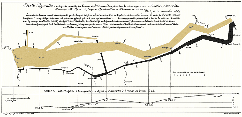
An early precursor to contemporary data visualizations, this infographic map depicts Napoleon’s ill-fated attempt at invading and conquering Russia in 1812.
In its time, this map was remarkable for its ability to compress the following six dimensions of data into a two-dimensional representation:
- troop quantity
- geographical distance travelled between the Poland-Russia border and Moscow
- the changing meteorological temperature from June 1812 to January 1813
- the changing troop locations (in terms of latitude and longitude)
- changing travel directions of the army
- location-specific dates and landmarks
Here’s a breakdown of the infographic map’s properties:
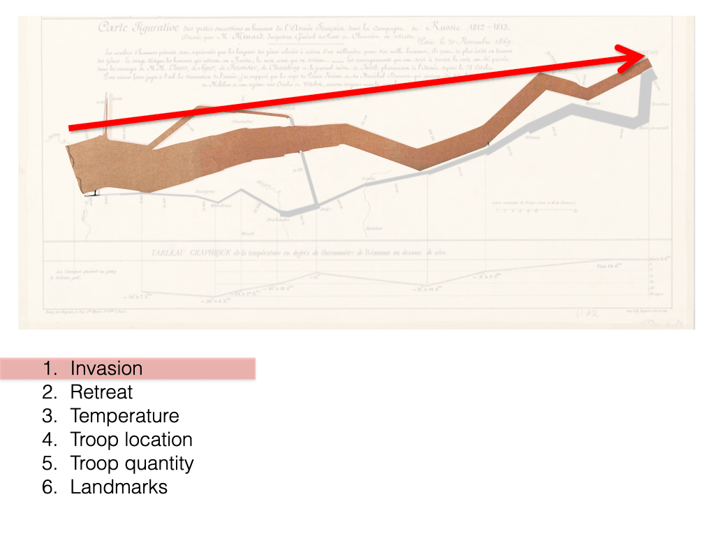
Detail of infographic elements conveying the invasion phase of the campaign. 
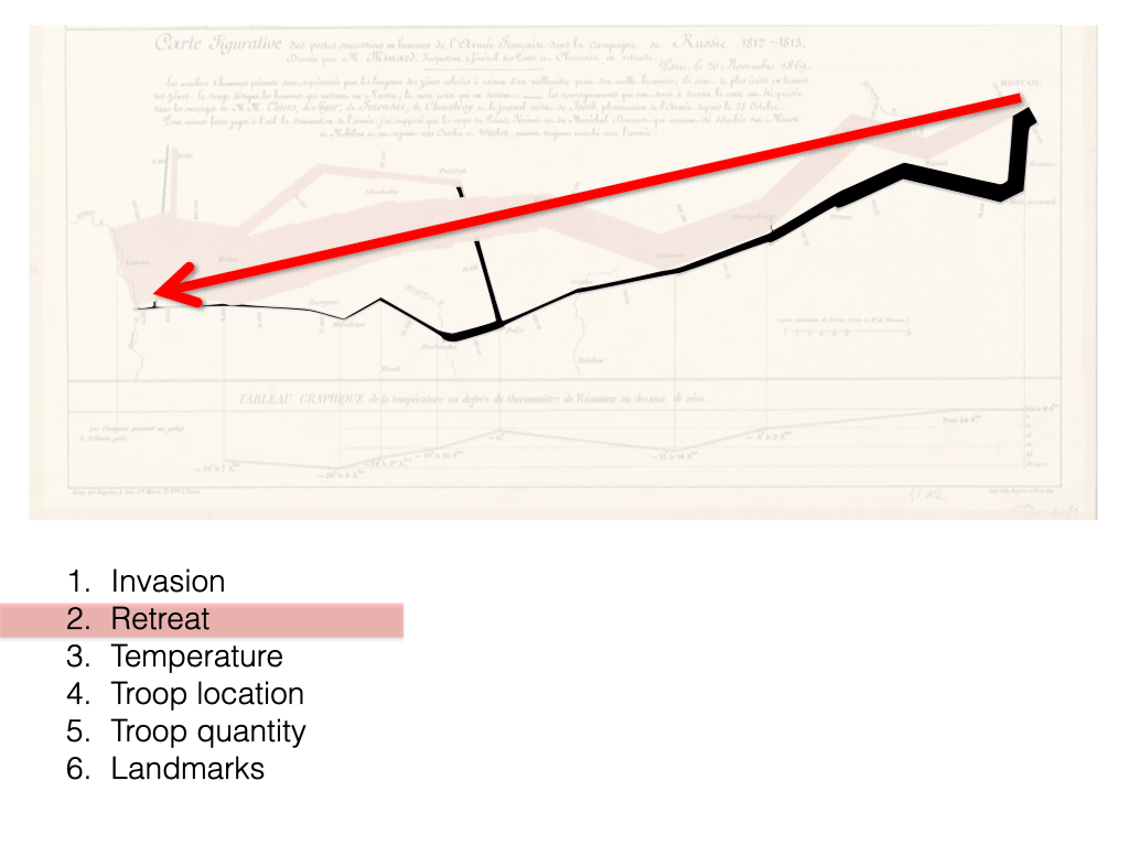
Detail of infographic elements conveying the retreat phase of the campaign. 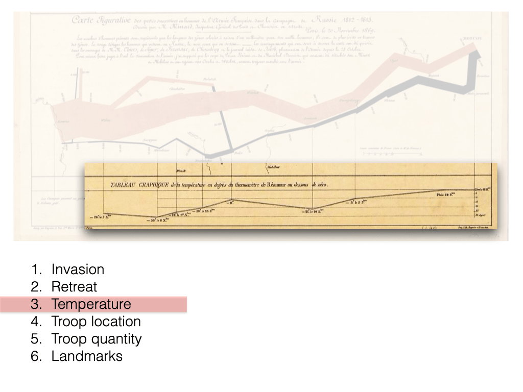
Detail of infographic elements conveying the changing temperatures during the army’s retreat. 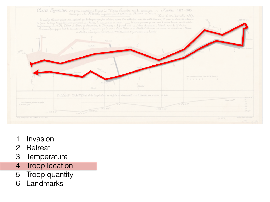
Detail of infographic elements conveying changing troop locations. 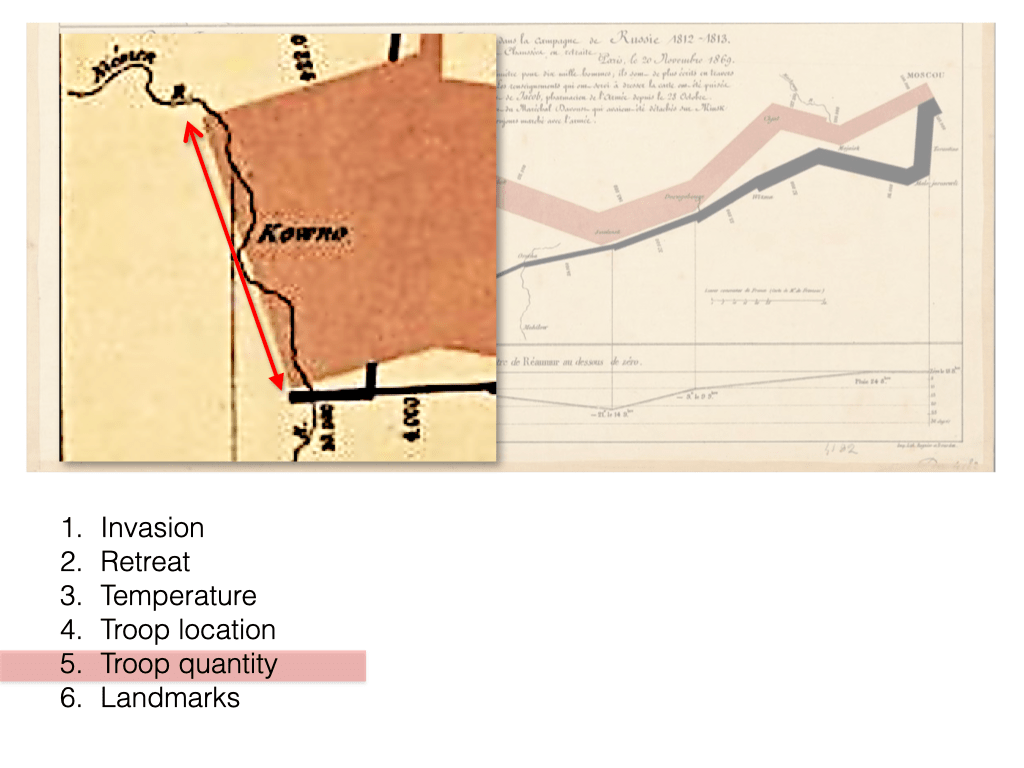
Detail of infographic elements conveying the changing troop quantities. 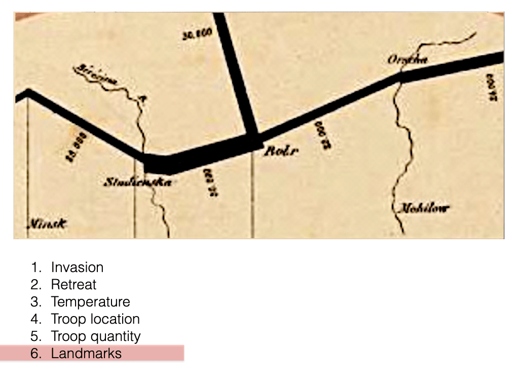
Detail of textual elements conveying significant geographic landmarks and troop quantities.
This map also exemplifies how a two-dimensional visual representation can effectively distill the informational content contained within a 574 word, text-only description.
Compare your experience of viewing the infographic above with reading the text-only description below. Pay attention to how they differ in terms of time and cognitive processing.
“In the Russian Campaign, the French Army started at the city of Kowno near the Neiman River, with 422,000 men advancing in the 2 o’clock direction. Halfway towards the city of Wilna, 22,000 men split off towards the north. The remaining 400,000 men continued advancing towards Wilna in the 4 o’clock direction. At Wilna 66,000 men split off towards the northeast. The remaining men continued advancing towards the city of Witebsk in the 2 o’clock direction. At Witebsk 175,000 men remained. They continued advancing towards the city of Smolensk in the 4 o’clock direction. At Smolensk 145,000 men remained. They continued advancing towards the city of Dorobobouge in the 2 o’clock direction. Then they continued advancing towards the city of Chjat towards the northeast. At Chjat 127,000 men remained. They continued advancing towards the city of Mojaisk in the 4 o’clock direction. At Mojaisk they crossed the Moskva [Moskowa in original] River, and 100,000 men remained. They continued advancing towards the city of Moscow [Moscou in original] towards the northeast. At Moscow 100,000 men remained. They started retreating southwards towards the city of Malo-jarosewli, via the city of Tarantino. On October 18 they reached Malo-jarosewli and the temperature was zero degrees Réaumur. The remaining 96,000 men took a short turn towards the southwest. On October 24, about halfway towards the city of Mojaisk, it rained. They continued retreating towards the city of Mojaisk in the 10 o’clock position, but the temperature started dropping. After reaching Mojaisk, the remaining 87,000 men continued retreating towards the city of Wizma to the southwest, After reaching Wizma, the remaining 55,000 men continued retreating towards the city of Dorogobouge to the southwest, On November 9 they reached the city of Dorogobouge. It was -9 Réaumur and the temperature started to drop more sharply. The remaining 37,000 men continued retreating towards the city of Smolensk in the 8 o’clock direction. On November 14 they reached the city of Smolensk. It was -21 Réaumur but the temperature started to rise. The remaining 24,000 men continued retreating towards the city of Orscha in the 8 o’clock direction. They crossed a river near Orscha, which was some distance north of Mohilow. The remaining 20,000 men continued retreating towards the city of Botr in the 8 o’clock direction. When they reached Botr it was -11 Réaumur, and the temperature started dropping again, but 30,000 men from the second split rejoined them. These 50,000 men continued retreating towards the city of Studienska in the 8 o’clock direction. On November 28 they reached Studienska near the Bérézina River, and it was -20 Réaumur. The remaining 28,000 men continued retreating to the northwest. On December 1 they reached somewhere north of Minsk, and it was -24 Réaumur. They continued retreating towards the city of Molodezno towards the southwest. On December 6 they reached Molodezno. It was -30 Réaumur, but the temperature started to slowly rise. The remaining 12,000 men continued retreating towards the city of Smorgoni in the 10 o’clock direction. At Smorgoni the remaining 14,000 men continued retreating towards the city of Wilna to the west. On December 7 8,000 men reached Wilna, and it was -26 Réaumur. They continued retreating towards the city of Kowno to the west. About one third along the way 4000 men remained. About two thirds along the way 6000 men from the first split rejoined them. These remaining 10,000 men continued retreating towards the city of Kowno to the west.”
Introduction to the Concept of Visual Variables in Data Visualization and Sonic Variables in Data Sonification
To illustrate what is meant by ‘sonic variables,’ here is a set of visual variables (position, size, shape, value, colour, orientation, texture) developed by early data visualization researcher Jacques Bertin in the 1970’s:
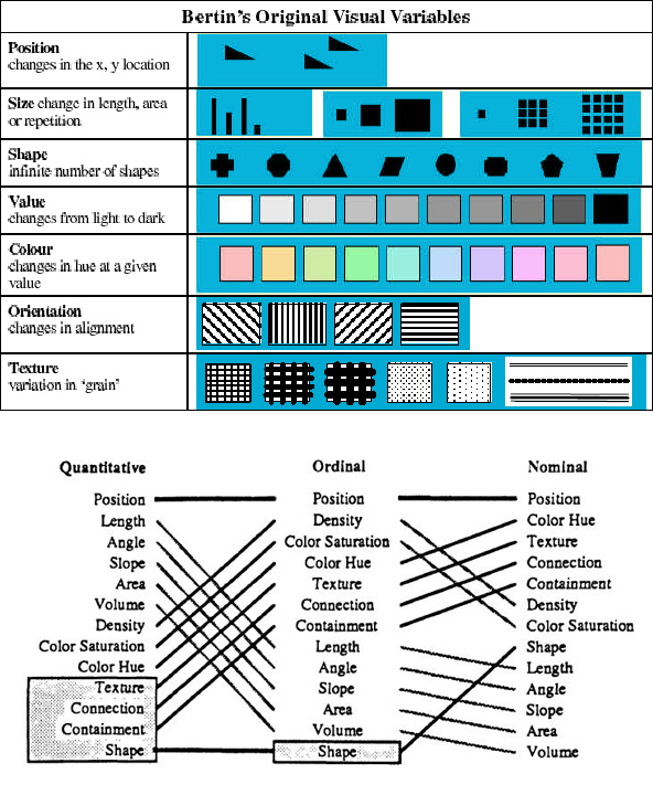
Today, these are widely accepted as the basic building blocks or vocabulary for creating visual representations of data for purposes of exploration and interpretation.
By comparison, here is a set of sonic variables (location, loudness, pitch, register, timbre, duration, rate of change, order, attack/decay) developed in 1994 by cartographer JB Krygier:
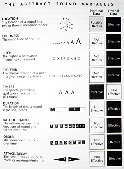
Today, these are widely accepted as the basic building blocks or vocabulary for creating data sonifications or auditory displays of information.
Design Prototypes
Sonifying Napoleons March Using Auditory Icons (“Audio Play”)
My earliest iteration, this is an audio-only sonification of the data collected and depicted by Minard in the original infographic.
In this iteration, pre-recorded foley effects (footsteps on a variety of surfaces) are combined with stereo panning and frequency filtering to convey changing troop quantities, troop direction, and geographic landmarks.
A single pair of footsteps represents 1000 troops. The footsteps were layered many times and mixed together in order to approximate the total size of the army (422,000 troops) at the beginning of the invasion.
Note: One as-yet-to-be-realized iteration of this project would be to involve percipients as participating live foley effects artists who follow a video-projected score to produce a participatory sound performance (or, I suppose, an info-sonic map).
Data-to-Sonic Variables Mappings:
- Kowno (Poland-Russia border) => far left stereo position
- Moscow (Russia) => far right stereo position
- Troop count => 1) quantity of footsteps; 2) field drum tempo (slower tempo = fewer troops)
- Terrain (seasonal) => footstep surface texture (i.e. winter = marching through snow sound effects)
- Temperature (during retreat phase only) => sine wave
Note: This sonification adheres to a strict temporal structure (1 second of audio = 1 day of the army’s campaign) whereas Minard’s original infographic does not.
Sonic Translation of Graphical Properties
This prototype explored how variations in the range of audible noise frequencies might be able to convey information about the changing line thicknesses both vertically and horizontally across the image through sound alone.
As the red slider is scrolled back and forth across the tan and black lines of Minard’s infographic map, the changing pixel colour data along the vertical (Y) axis determines which filter bands will allow white noise to pass through at any given point on the the surface of the map. At the same time, the stereo position of the resulting sound is mapped to the horizontal (X) axis.
Prototype Demonstrating Interactive Data Sonification of Charles Minard’s 1869 Infographic “Figurative Map of the Successive Losses in Men of the French Army in the Russian Campaign 1812–1813” Through Graphical Navigation.
Sonification Demo: Napoleon’s March Sonification Through Graphical Navigation from Richard C. Windeyer on Vimeo.
In this iteration, I retained the use of frequency-specific band-pass filters and stereo positioning as a way to convey spatial position across the surface of the image, but combined this with the marching footsteps sound effects used in the earlier prototypes.
A pure tone was also added to depict the falling temperatures endured by the troops during the retreat phase of the campaign.
Intended for visually-impaired percipients, the spatial properties of Minard’s two-dimensional infographic are conveyed through computer mouse cursor position onscreen.
Data-to-Sonic Variable Mappings:
- Kowno (Poland-Russia border) => far left stereo position
- Moscow (Russia) => far right stereo position
- Troop count => marching tempo (slower tempo = fewer troops)
- Terrain (seasonal) => footstep surface texture (i.e. winter = marching through snow sound effects)
- Latitude/Longitude =>centre frequency/pitch of white noise band
- Temperature (during retreat phase only) => sine wave
Note: This sonification adheres to a strict temporal structure (1 second of audio = 1 day of the army’s campaign) whereas Minard’s original infographic does not.
This particular iteration was valuable for the many questions it provoked about the peripheral aspects of perception — and the tendencies for percipients to lose their sense of spatial position while exploring the prototype.
This iteration also led to a greater focus on player experiences with audio-only video games—particularly those games that used 360-degree surround-sound encoding as a means of immersing players in the gaming environment. We began to refer to this use of immersive, surround-sound encoding as ‘the World of Warcraft metaphor.’
Sonification Prototype 2.0: A Binaural Translation of Charles Minard’s Infographic Map
In this iteration, the sound of marching footsteps are indexed and mapped within a virtual surround-sound auditory space designed to exploit a fundamental affordance of human hearing: the ability to decipher information within an environment through the localization of discrete sound events within a 360 degree radius around the percipient.
The intention of this prototype was to develop strategies for translating the graphical properties of a map into a virtual auditory space for use by visually-impaired individuals.
Precise quantities of troops and the names of nearby cities are represented through text-to-speech synthesis. These are activated by tapping designated keys on a computer keyboard (‘q’ for troop quantities; ‘w’ for locations)
During the production of this iteration, much of our conceptual work had begun to focus on acquiring a better understanding of how different kinds of sonic variables serve the task of representation terms of semiotics (the study of signs and symbols and their use or interpretation) and auditory cognition. Much of this thinking involved consolidating scholarly research in the field of auditory display design (Kramer; Walker; Keller & Stevens; Gaver).
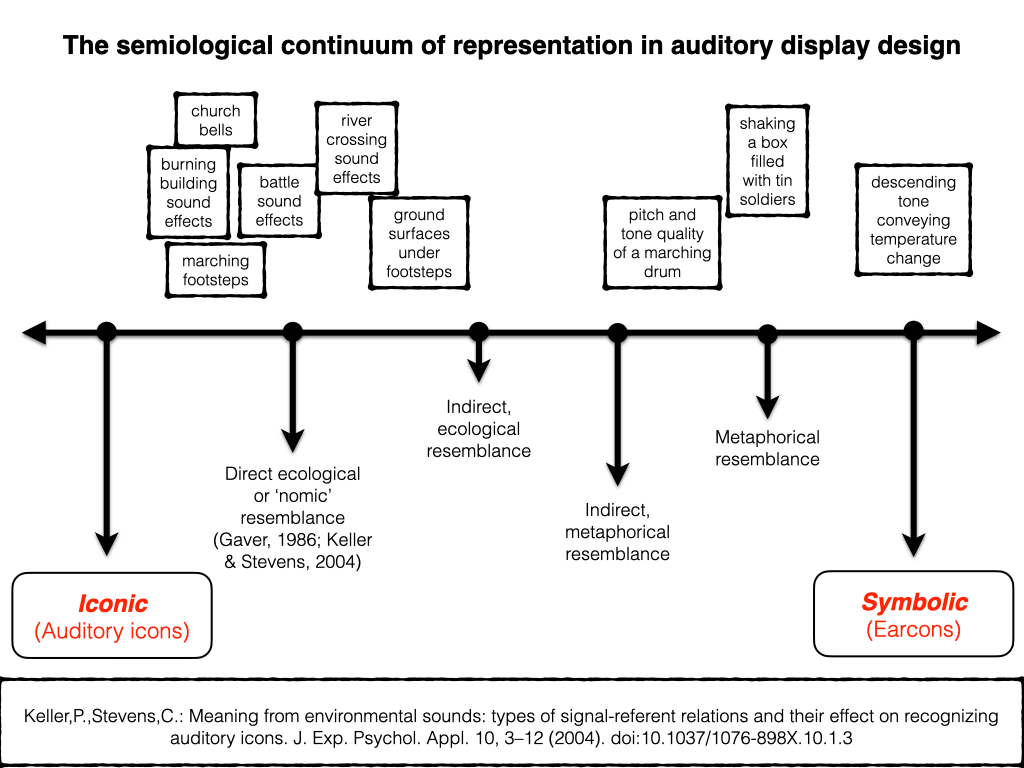
The sounds of footsteps, marching drums, church bells and military battles draw upon ecological resemblance (the sound resembles the thing it represents either directly or indirectly).
By contrast, the descending tone representing temperature change is considered symbolic, meaning that the sound represents something through the establishment of a convention which is to be made clear to the percipient prior to their engagement with the representation.
Yet as design researcher Bill Gaver observed, direct/indirect ecological and symbolic mappings are not distinct or separate categories but are really just points positioned across a representational continuum, with the majority of mappings used to depict data through sound tending to fall between these points (Gaver, 1986).
For example, direct ecological mappings are usually easier to learn because they draw upon a percipient’s pre-existing experiences and interactions with sound.
By contrast, indirect ecological or metaphorical mappings are somewhat harder to learn, and symbolic mappings are the most difficult of all. (Gaver, 1986)
Sonification Prototype: a binaural translation of Charles Minard’s infographic “Figurative Map of the Successive Losses in Men of the French Army in the Russian campaign 1812–1813” (1869) (version 2.1)
Sonification Prototype: a binaural translation of Charles Minard’s infographic depiction of Napoleon’s Russian campaign from Richard C. Windeyer on Vimeo.
This final iteration attempted to exploit how percipients can develop an ability to estimate the quantity of some thing inside a container just by shaking the container and interpreting the balance between the hollow, resonant sound of the container and the sounds of the objects rattling around inside.
For this iteration, I envisioned a percipient shaking a wooden or metal box containing a quantity of tin toy soldiers rattling around inside.
Could a percipient obtain an impression of the rate at which the troops were diminishing?
Simultaneously, how would the physical act of shaking a box filled with toy soldiers influence or colour a percipient’s experience?
Would the knowledge that the box contains toy soldiers and that the subject of the work is Napoleon’s failed attempt at invading Russia soldiers provoke associations and interpretations between the notion of toy soldiers and how Napoleon may be regarded his troops when he sent hundreds of thousands of troops into an inhospitable terrain without appropriate supplies, uniforms or anticipation of the coming Russian winter?
Playback and Presentation
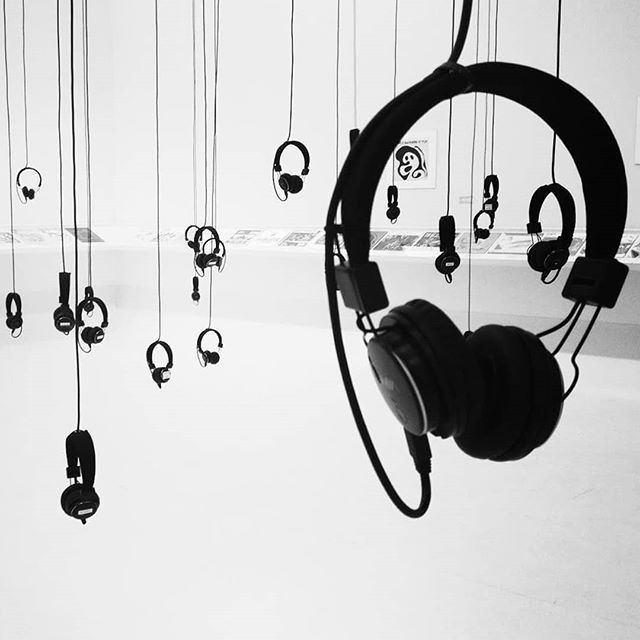
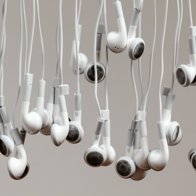
Headphones (for single-person listening experiences)
Loudspeakers
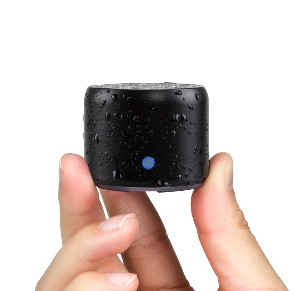
Small, portable, wireless (Bluetooth)
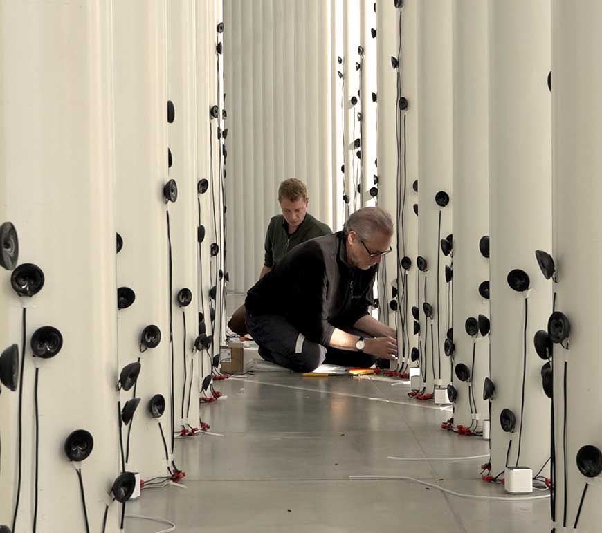
Installations using just the bare speaker drivers (cones):
Canadian-German sound installation artist Robin Minard:
Playback sources:
- mobile devices, iPods, laptops,
- Recordable sound chips:

- Recordable sound chips:
Examples of Sound Installation Art
Suggested Reading
- Bregman, A. S. (1990) Auditory scene analysis. MIT Press: Cambridge, MA
- Farnell, Andy. Designing Sound. MIT Press, 2010.
- Franinović, Karmen et al. Sonic Interaction Design. MIT Press, 2013.
- Gaver, William & W, William. (2020). Everyday listening and auditory icons. Thesis (Ph. D.) University of California, San Diego, Department of Cognitive Science and Psychology, 1988.
- Gaver, William W. “What in the World Do We Hear?: An Ecological Approach to Auditory Event Perception.” Ecological psychology, vol. 5, no. 1, 1993, pp. 1-29.
- Hermann, Thomas et al. The Sonification Handbook. Logos Verlag Berlin, 2011. https://sonification.de/handbook/.
- Keller, P., & Stevens, C. (2004). Meaning from environmental sounds: Types of signal-referent relations and their effect on recognizing auditory icons. Journal of experimental psychology: Applied, 10(1), 3.
- Schafer, R Murray. The Soundscape: Our Sonic Environment and the Tuning of the World. Simon and Schuster, 1993.
- Truax, Barry. Acoustic Communication. Greenwood Publishing Group, 2001.
- Walker, B. N., & Kramer, G. (2005). Mappings and metaphors in auditory displays: An experimental assessment. ACM Transactions on Applied Perception (TAP), 2(4), 407-412.